


Além de ser um projeto extremamente forte, instigante e leve, a identidade visual desenvolvida para o Fórum Cultural tem como proposta principal ser composta por estruturas básicas muito eficientes e sólidas, sobre as quais diversos elementos gráficos e fotos são trabalhados. O resultado é a apresentação dos aspectos da realidade, espírito e valores tão presentes nos diversos espaços e vivências da escola com seus alunos, em suas diferentes fases de vida.
Em contraste com este excesso de informação visual, foi criado um padrão mais delicado, majoritariamente composto pela relação entre planos de cores pastéis e suaves.

O Site da Busch Amazon foi desenhado com base na identidade visual forte da marca, buscando extrair a energia da Floresta Amazônica e trazer para seu layout.
O site foi construído em apenas uma página, através do sistema de ancoragem, para que o usuário possa navegar sem mudar de página e ter uma experiência única e prática de navegação, contemplando e dando o devido destaque a todas as informações necessárias.
‘‘A Marca Busch Amazon nasce não tão somente como mais uma marca, ela nasce para oferecer os melhores e mais puros produtos possíveis, pois nasce com o DNA da maior floresta do mundo!’’
CARTILHA DO
PRIMEIRO EMPREGO
LIVRO COMEMORATIVO
LASSBIO 20 ANOS
LIVRO COMEMORATIVO
LASSBIO 20 ANOS
LIVRO COMEMORATIVO
LASSBIO 20 ANOS
LIVRO COMEMORATIVO
LASSBIO 20 ANOS
LIVRO COMEMORATIVO
LASSBIO 20 ANOS
EVENTOS E CAMPANHAS
EVENTOS E CAMPANHAS


O que o cliente desse serviço procura é um espaço
com qualidade, conforto e infraestrutura. Assim, o
desenho da planta do espaço se torna mais do que
um elemento ilustrativo, se transforma em um
elemento instigante, no qual o cliente verá
simbolizado exatamente o que ele procura.
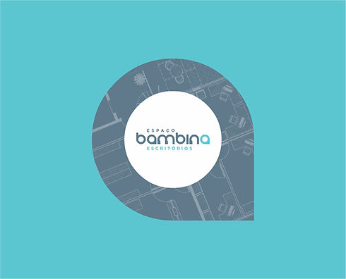
As plantas utilizadas são as do Espaço Bambina,
retratando a distribuição atual e outras possibilidades de organização do espaço. Tal tratamento gráfico personaliza a Identidade Visual e mostra a riqueza e variedade de opções que a empresa oferece.
As diversas peças de comunicação apresentam uma variedade de espaços dos diferentes andares do Espaço Bambina.
O que o cliente desse serviço procura é um espaço
com qualidade, conforto e infraestrutura. Assim, o
desenho da planta do espaço se torna mais do que
um elemento ilustrativo, se transforma em um
elemento instigante, no qual o cliente verá
simbolizado exatamente o que ele procura.
As plantas utilizadas são as do Espaço Bambina,
retratando a distribuição atual e outras possibilidades de organização do espaço. Tal tratamento gráfico personaliza a Identidade Visual e mostra a riqueza e variedade de opções que a empresa oferece.
As diversas peças de comunicação apresentam uma variedade de espaços dos diferentes andares do Espaço Bambina.


xxxxxxxxxxxxxxxxxxxxxxxxxxxxxxxxxxxxxxxxxxxxxxxxxxxxxxxxxxxxxxxxxxxxxxxxxxxxxxxxxxxxxxxxxxxxxxxxxxxxxxxxxxxxxxxxxxxxxxxxxxxxxxxxxxxxxxxxxxxxxxxxxxxxxxxxxxxxxxxxxxxxxxxxxxxxxxxxxxxxxxxxxxxxxxxxxxxxxxxxxxxxxxxxxxxxxxxxxxxxxxxxxxxxxxxxxxxxxxxxxxxxxxxxxxxxxxxxxxxxxxxxxxxxxxxxxxxxxxxxxxxxxxxxxxxxxxxxxxxxxxxxxxxxxxxxxxxxx

A Identidade Visual da Fernanda Bernardo Jóias apresenta a marca como referência em exclusividade, bom gosto, sofisticação e luxo.
A Marca e os elementos visuais desenvolvidos propõem uma atmosfera de valorização dos detalhes e do processo de criação de cada peça, desde o desenho inicial até a produção e acabamento.
A comunicação a ser desenvolvida apresentará a determinação da equipe Fernanda Bernardo na busca constante pela perfeição em beleza, qualidade e requinte.
Os produtos da Marca serão considerados verdadeiros privilégios para quem os usa.

AO MESTRE,
COM CARINHO


Besides being an extremely strong, instigating and light project, the visual identity developed for the school's website has as main proposal to be composed of very efficient and solid basic structures, on which several graphic elements and photos are worked. The result is the presentation of the aspects of reality, spirit and values so present in the spaces and experiences of the school with its students, in their different stages of life.
In contrast to this stimulus of visual information, a more delicate and sober pattern was created, mostly composed by the relationship between pastel and soft color layers.
CONSTRUCTION
GRID
The main visual reference within the proposed project for the school's website is based on the creation of modules that divide the total viewing area into a set of equal rectangles. The elements arranged on the page sometimes follow the grid rectangles. These rectangles are distributed in order to present elements that deserve more or less scale and highlight.
Such a combination presents different graphic configurations. These structures, extremely strong and striking, create relations and proportions that are very instigating and pleasant to look at.


The palette developed for visual identity of the Forum starts with a set of colors coming from small variations of primary and secondary colors.
The colors used in the pages of the site change according to the age group they represent. The colors have a reduction in their saturation and brightness, turning into more discreet and less basic colors. The more sober colors are used in the information referring to the High School and the more vivid and warm colors, for Kindergarten and Elementary School.
Such color differentiation segments the public, respecting the characteristics of each phase of the student's development and makes the identification easier by users when navigating on the site.
The neutral colors, with more pastel tones, allow the warm colors to pop out. The background and header of the site make the necessary contrast to balance the colors and the navigation.
Such a set of colors has the necessary contrast capable of making your compositions pleasant to the sight, complementary, soft, delicate and of extreme good taste. The smoother color palette had as initial reference the color of the school uniform, thus ensuring full integration of the colors used by the Forum in its website.


CONTENT
EDITION
We have built a complete and intuitive control panel for the client to make the necessary changes without encountering any difficulties. Anyone can easily navigate the control panel and make the necessary changes, which include: changing texts, titles, images and even some small changes in layout, without losing the proposed visual identity.
We designed a website that could be adapted to mobile devices with a responsive and easy to navigate layout, without modifying its characteristics when viewed through the screen of a smartphone or tablet.