


Além de ser um projeto extremamente forte, instigante e leve, a identidade visual desenvolvida para o Fórum Cultural tem como proposta principal ser composta por estruturas básicas muito eficientes e sólidas, sobre as quais diversos elementos gráficos e fotos são trabalhados. O resultado é a apresentação dos aspectos da realidade, espírito e valores tão presentes nos diversos espaços e vivências da escola com seus alunos, em suas diferentes fases de vida.
Em contraste com este excesso de informação visual, foi criado um padrão mais delicado, majoritariamente composto pela relação entre planos de cores pastéis e suaves.

O Site da Busch Amazon foi desenhado com base na identidade visual forte da marca, buscando extrair a energia da Floresta Amazônica e trazer para seu layout.
O site foi construído em apenas uma página, através do sistema de ancoragem, para que o usuário possa navegar sem mudar de página e ter uma experiência única e prática de navegação, contemplando e dando o devido destaque a todas as informações necessárias.
‘‘A Marca Busch Amazon nasce não tão somente como mais uma marca, ela nasce para oferecer os melhores e mais puros produtos possíveis, pois nasce com o DNA da maior floresta do mundo!’’
CARTILHA DO
PRIMEIRO EMPREGO
LIVRO COMEMORATIVO
LASSBIO 20 ANOS
LIVRO COMEMORATIVO
LASSBIO 20 ANOS
LIVRO COMEMORATIVO
LASSBIO 20 ANOS
LIVRO COMEMORATIVO
LASSBIO 20 ANOS
LIVRO COMEMORATIVO
LASSBIO 20 ANOS
EVENTOS E CAMPANHAS
EVENTOS E CAMPANHAS


O que o cliente desse serviço procura é um espaço
com qualidade, conforto e infraestrutura. Assim, o
desenho da planta do espaço se torna mais do que
um elemento ilustrativo, se transforma em um
elemento instigante, no qual o cliente verá
simbolizado exatamente o que ele procura.
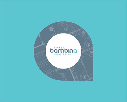
As plantas utilizadas são as do Espaço Bambina,
retratando a distribuição atual e outras possibilidades de organização do espaço. Tal tratamento gráfico personaliza a Identidade Visual e mostra a riqueza e variedade de opções que a empresa oferece.
As diversas peças de comunicação apresentam uma variedade de espaços dos diferentes andares do Espaço Bambina.
O que o cliente desse serviço procura é um espaço
com qualidade, conforto e infraestrutura. Assim, o
desenho da planta do espaço se torna mais do que
um elemento ilustrativo, se transforma em um
elemento instigante, no qual o cliente verá
simbolizado exatamente o que ele procura.
As plantas utilizadas são as do Espaço Bambina,
retratando a distribuição atual e outras possibilidades de organização do espaço. Tal tratamento gráfico personaliza a Identidade Visual e mostra a riqueza e variedade de opções que a empresa oferece.
As diversas peças de comunicação apresentam uma variedade de espaços dos diferentes andares do Espaço Bambina.


xxxxxxxxxxxxxxxxxxxxxxxxxxxxxxxxxxxxxxxxxxxxxxxxxxxxxxxxxxxxxxxxxxxxxxxxxxxxxxxxxxxxxxxxxxxxxxxxxxxxxxxxxxxxxxxxxxxxxxxxxxxxxxxxxxxxxxxxxxxxxxxxxxxxxxxxxxxxxxxxxxxxxxxxxxxxxxxxxxxxxxxxxxxxxxxxxxxxxxxxxxxxxxxxxxxxxxxxxxxxxxxxxxxxxxxxxxxxxxxxxxxxxxxxxxxxxxxxxxxxxxxxxxxxxxxxxxxxxxxxxxxxxxxxxxxxxxxxxxxxxxxxxxxxxxxxxxxxx

A Identidade Visual da Fernanda Bernardo Jóias apresenta a marca como referência em exclusividade, bom gosto, sofisticação e luxo.
A Marca e os elementos visuais desenvolvidos propõem uma atmosfera de valorização dos detalhes e do processo de criação de cada peça, desde o desenho inicial até a produção e acabamento.
A comunicação a ser desenvolvida apresentará a determinação da equipe Fernanda Bernardo na busca constante pela perfeição em beleza, qualidade e requinte.
Os produtos da Marca serão considerados verdadeiros privilégios para quem os usa.

AO MESTRE,
COM CARINHO


A PLEASANT
CHALLENGE
A school that sees beyond. Where the director, owner and founder of the institution, knows all students by the name. A different way of being a school, of giving attention, of accompanying, of valuing, of understanding and preparing children for real life, not just for an admission or an Enem test.
In the preliminary study it was identified that it was necessary to create visual lines and content presentation that differentiated students and families from different segments of the school, under the risk that families and students would not identify themselves with the institution, as they did not get the synergy between what is being offered by the Cultural Forum and their own expectations of the school.
In this way, a communication line was developed capable of providing the necessary elements for the Cultural Forum to be able to communicate with its different audiences, mainly students and family, transmitting the excellence offered by the school in the different phases of its students' school life.

THE VISUAL
IDENTITY
Extremely strong, light and thought-provoking, the Visual Identity Program that Claudio Ventura Studio developed for the Fórum Cultural had as its main proposal to be composed of very efficient and solid basic structures, on which various graphic elements and photos can be worked. The result is the presentation of aspects of reality, spirit and values that are so present in the different spaces and experiences of the school with its students, in their different phases of life.
The color palette is rich and very unique, making it possible, just by its colors, for the Fórum Cultural's community to recognize, in the midst of the troubled daily life, an “island” of respect, peace and friendship, the spirits so present at school.
CONSTRUCTION
GRID
The Construction Grid, a basic structure created to illustrate the school's communication pieces, can be filled with different images, sometimes whole, sometimes cut, in order to offer greater emphasis on details that are important in each moment of communication. The relationship between these images presents a strong contrast of shapes, colors, concepts and meanings.
Thus, each piece of communication fits perfectly to its function and its audience, keeping the extremely strong and remarkable Visual Identity.
In addition to the concept to be conveyed by each image, its set applied to the pieces is worked so that the colors and lines of construction, as well as its entire relationship with the adjacent images, offer a special highlight, strong and pleasant to look at.
In contrast to this excess of visual information, a more delicate pattern was created, mostly composed of the relationship between pastel and soft color planes. On this pattern, some illustrated icons presents elements of the academic experience, accurately contextualizing the institution's proposal in a playful and light way.


