


Além de ser um projeto extremamente forte, instigante e leve, a identidade visual desenvolvida para o Fórum Cultural tem como proposta principal ser composta por estruturas básicas muito eficientes e sólidas, sobre as quais diversos elementos gráficos e fotos são trabalhados. O resultado é a apresentação dos aspectos da realidade, espírito e valores tão presentes nos diversos espaços e vivências da escola com seus alunos, em suas diferentes fases de vida.
Em contraste com este excesso de informação visual, foi criado um padrão mais delicado, majoritariamente composto pela relação entre planos de cores pastéis e suaves.

O Site da Busch Amazon foi desenhado com base na identidade visual forte da marca, buscando extrair a energia da Floresta Amazônica e trazer para seu layout.
O site foi construído em apenas uma página, através do sistema de ancoragem, para que o usuário possa navegar sem mudar de página e ter uma experiência única e prática de navegação, contemplando e dando o devido destaque a todas as informações necessárias.
‘‘A Marca Busch Amazon nasce não tão somente como mais uma marca, ela nasce para oferecer os melhores e mais puros produtos possíveis, pois nasce com o DNA da maior floresta do mundo!’’
CARTILHA DO
PRIMEIRO EMPREGO
LIVRO COMEMORATIVO
LASSBIO 20 ANOS
LIVRO COMEMORATIVO
LASSBIO 20 ANOS
LIVRO COMEMORATIVO
LASSBIO 20 ANOS
LIVRO COMEMORATIVO
LASSBIO 20 ANOS
LIVRO COMEMORATIVO
LASSBIO 20 ANOS
EVENTOS E CAMPANHAS
EVENTOS E CAMPANHAS


O que o cliente desse serviço procura é um espaço
com qualidade, conforto e infraestrutura. Assim, o
desenho da planta do espaço se torna mais do que
um elemento ilustrativo, se transforma em um
elemento instigante, no qual o cliente verá
simbolizado exatamente o que ele procura.
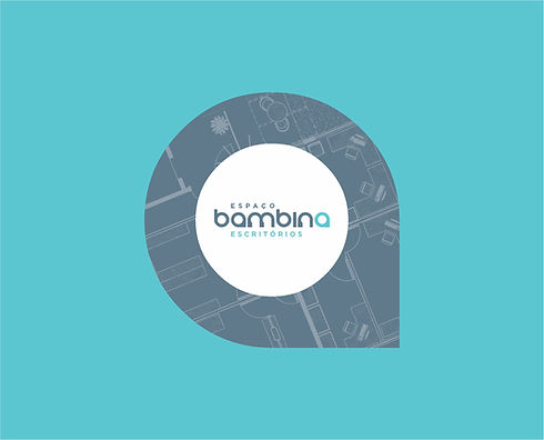
As plantas utilizadas são as do Espaço Bambina,
retratando a distribuição atual e outras possibilidades de organização do espaço. Tal tratamento gráfico personaliza a Identidade Visual e mostra a riqueza e variedade de opções que a empresa oferece.
As diversas peças de comunicação apresentam uma variedade de espaços dos diferentes andares do Espaço Bambina.
O que o cliente desse serviço procura é um espaço
com qualidade, conforto e infraestrutura. Assim, o
desenho da planta do espaço se torna mais do que
um elemento ilustrativo, se transforma em um
elemento instigante, no qual o cliente verá
simbolizado exatamente o que ele procura.
As plantas utilizadas são as do Espaço Bambina,
retratando a distribuição atual e outras possibilidades de organização do espaço. Tal tratamento gráfico personaliza a Identidade Visual e mostra a riqueza e variedade de opções que a empresa oferece.
As diversas peças de comunicação apresentam uma variedade de espaços dos diferentes andares do Espaço Bambina.


xxxxxxxxxxxxxxxxxxxxxxxxxxxxxxxxxxxxxxxxxxxxxxxxxxxxxxxxxxxxxxxxxxxxxxxxxxxxxxxxxxxxxxxxxxxxxxxxxxxxxxxxxxxxxxxxxxxxxxxxxxxxxxxxxxxxxxxxxxxxxxxxxxxxxxxxxxxxxxxxxxxxxxxxxxxxxxxxxxxxxxxxxxxxxxxxxxxxxxxxxxxxxxxxxxxxxxxxxxxxxxxxxxxxxxxxxxxxxxxxxxxxxxxxxxxxxxxxxxxxxxxxxxxxxxxxxxxxxxxxxxxxxxxxxxxxxxxxxxxxxxxxxxxxxxxxxxxxx

A Identidade Visual da Fernanda Bernardo Jóias apresenta a marca como referência em exclusividade, bom gosto, sofisticação e luxo.
A Marca e os elementos visuais desenvolvidos propõem uma atmosfera de valorização dos detalhes e do processo de criação de cada peça, desde o desenho inicial até a produção e acabamento.
A comunicação a ser desenvolvida apresentará a determinação da equipe Fernanda Bernardo na busca constante pela perfeição em beleza, qualidade e requinte.
Os produtos da Marca serão considerados verdadeiros privilégios para quem os usa.

AO MESTRE,
COM CARINHO


Working inks, the colors, the possibilities.
Show passion for graphic arts.
To present basic principles of the graphic universe.
These were the concepts chosen by
Claudio Ventura Studio to present
Grafica As de Ouro to the market.


The random treatment of colored and overlapping spots, the handwritten lines that make up the illustrated element "A", the strong and remarkable letters of the As de Ouro logo. The elements are so distinct and together they present an extremely strong and unique Visual Identity, especially in the graphic universe.
VISUAL
IDENTITY


